
Brand Diary:
A modern and modular UI
for a Bangkok-based creative agency
Role
UI Designer
Team
Treasure Su / UX Designer
Tool
Figma
Duration
5-6 Weeks
The identity was sharp,
the website wasn’t
Brand Diary had a strong creative identity but an outdated website that failed to reflect it. They needed a complete redesign, one that felt modern, structured, and aligned with their bold, design-forward personality. With the UX already mapped, the focus shifted to crafting a clean, scalable UI that captured their voice and elevated their digital presence.
Clearer, cleaner, and modular,
exactly what the UI needed to be
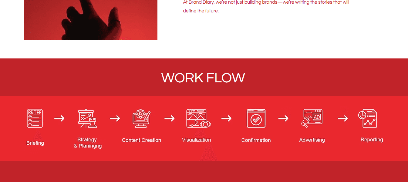
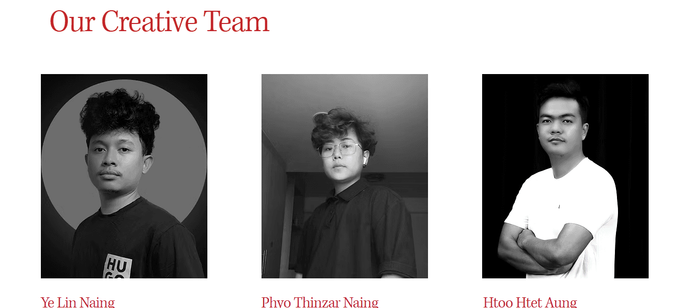
The redesigned site introduces a modern, modular UI that brings clarity and polish to Brand Diary’s digital presence. With improved structure, strong typography, and flexible layouts, the new design elevates key pages like Services and Team while remaining fully responsive and scalable. It’s simple, clean, and finally aligned with the brand’s creative confidence.
The rules behind the look
Archivo
H2
H1
H3
H4
H5
Body 1
Body 2
Body 3
Button 1
Button 2
Button 3
Caption
Noto Sans Myanmar
H2
H1
H3
H4
H5
Body 1
Body 2
Body 3
Button 1
Button 2
Button 3
Caption
Archivo brings a modern, structured aesthetic that fits Brand Diary’s creative and confident tone. Its geometric shapes and clean lines make it ideal for headings, layouts, and content that needs a bold presence.
Noto Sans Myanmar was chosen specifically to support Burmese-language content. Since Brand Diary is a Myanmar-owned agency, it was essential to ensure that the site remained accessible and visually consistent for local users. This font handles Myanmar script cleanly, balancing clarity with a neutral, friendly feel.
Type choices that speak the brand
Red and black to bring boldness,
and stand out in a crowded space
#171717
#FE001A
#C31F26
#FF6672
#FBFBFB
Red is the hero. It’s bright, full of energy, and represents the brand’s bold attitude. Multiple shades were used to keep it interesting but not overwhelming.
Black adds structure, keeping everything grounded and easy to read.
Off-white balances it all out, giving the red room to pop without stealing the show.
The color palette sticks to what makes
Brand Diary stand out, bold reds and deep blacks.
It’s a simple combo, but it makes a strong statement.
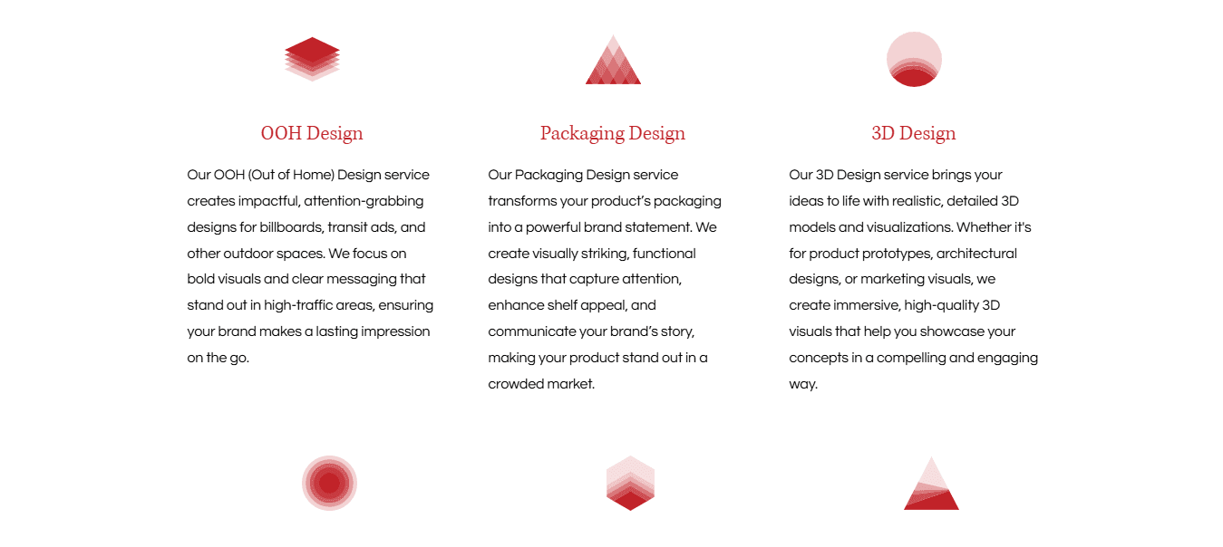
Every detail in the UI was designed to feel cohesive, flexible, and unmistakably Brand Diary. From bold buttons to clean form elements and modular content blocks, each component worked together to create a seamless experience across pages. The system made it easy to adapt layouts without losing consistency or personality. These parts weren’t just decorative—they were the essential pieces that brought the brand’s voice, energy, and clarity to life.
Parts that power the experience
Contact Us
Contact Us
Read More
Read More
More Testimonials
More Testimonials
branddiary.mm@gmail.com
branddiary.mm@gmail.com


Before diving into visuals, the focus was on getting the structure right. The wireframes laid the foundation for a smoother, more thoughtful user experience, designed around how Brand Diary tells its story.
With bold, modular layouts and clear hierarchy, each section showcased the agency’s personality without distraction. Minimal but intentional, the frames gave Brand Diary’s voice space to come through. No polish yet, just purpose.
Just the frameworks,
but still telling a story
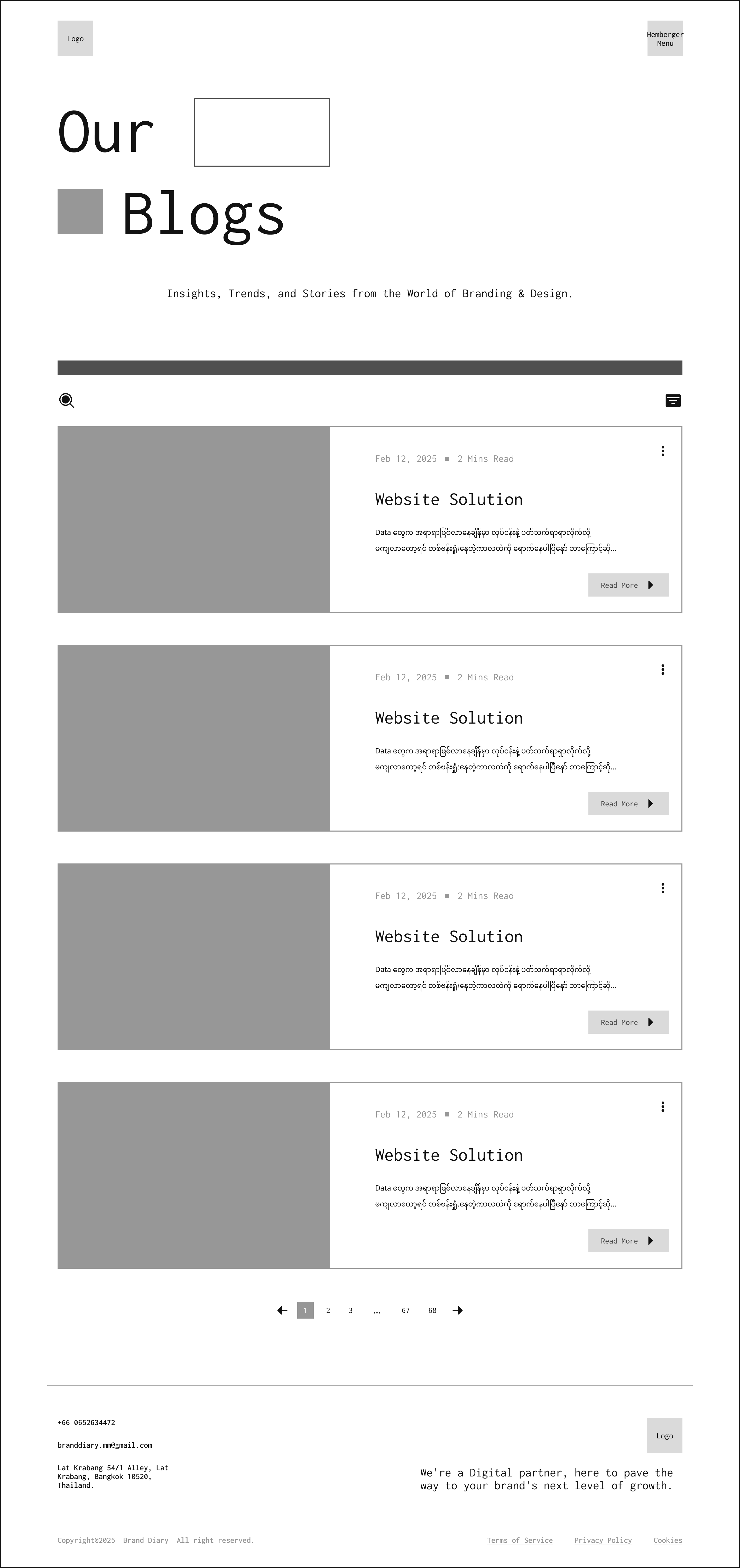

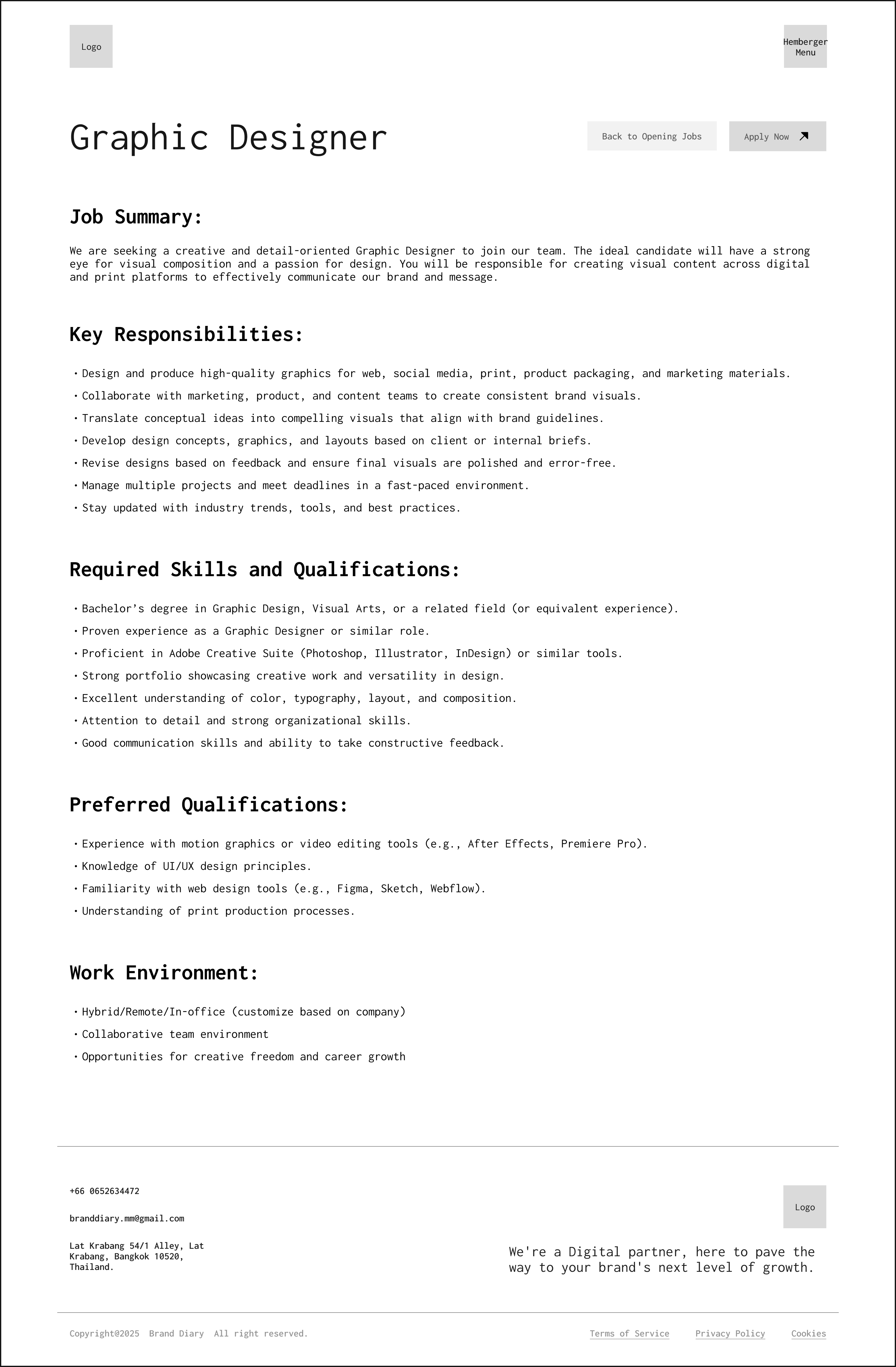
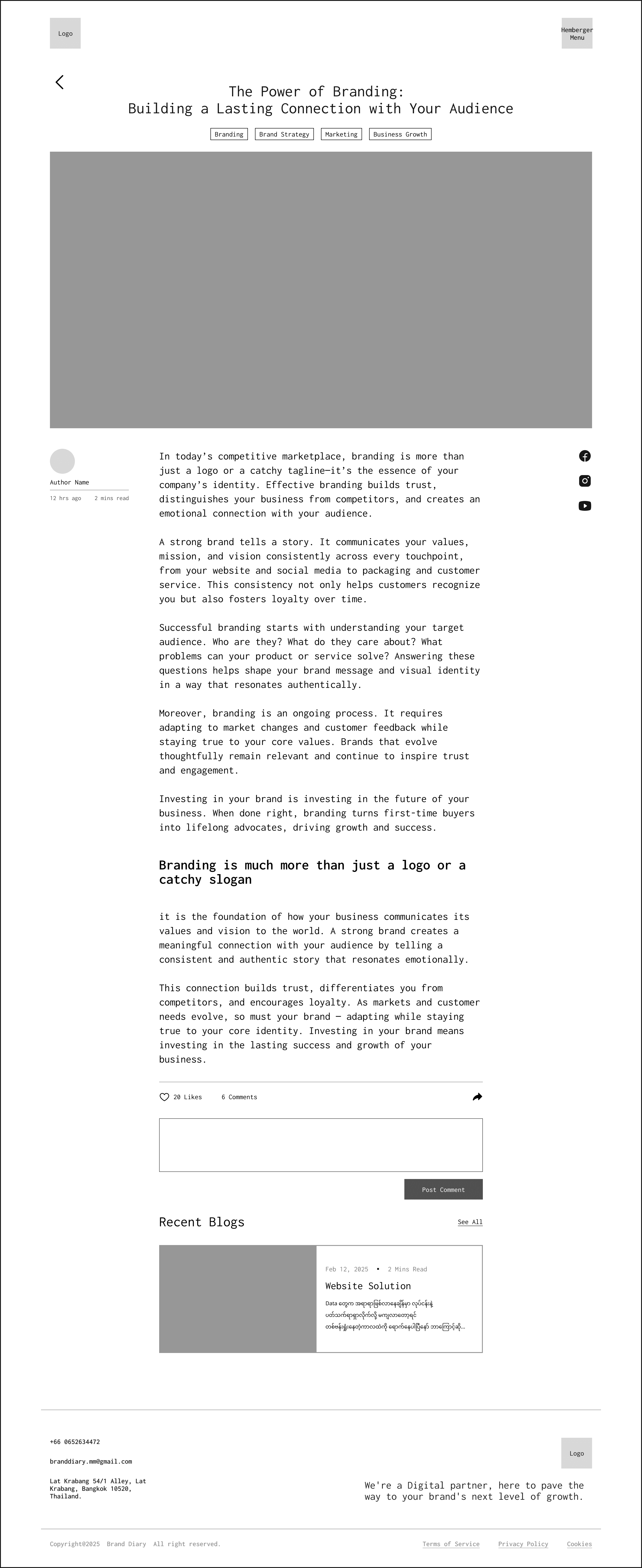
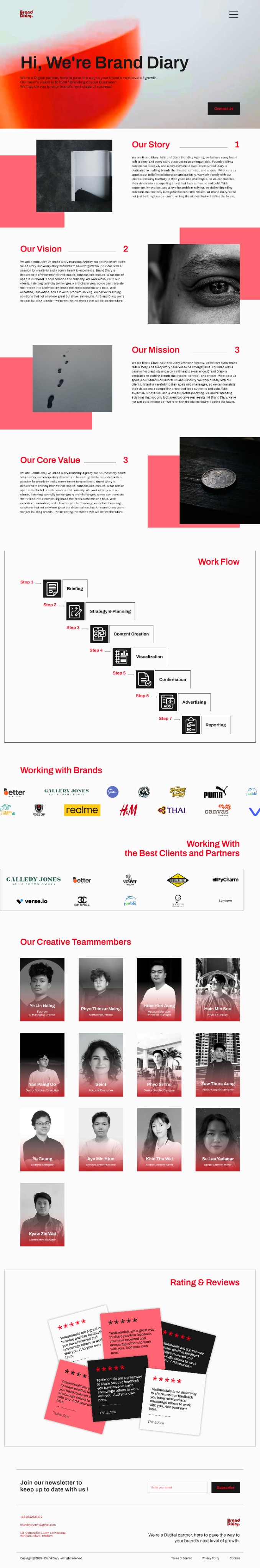
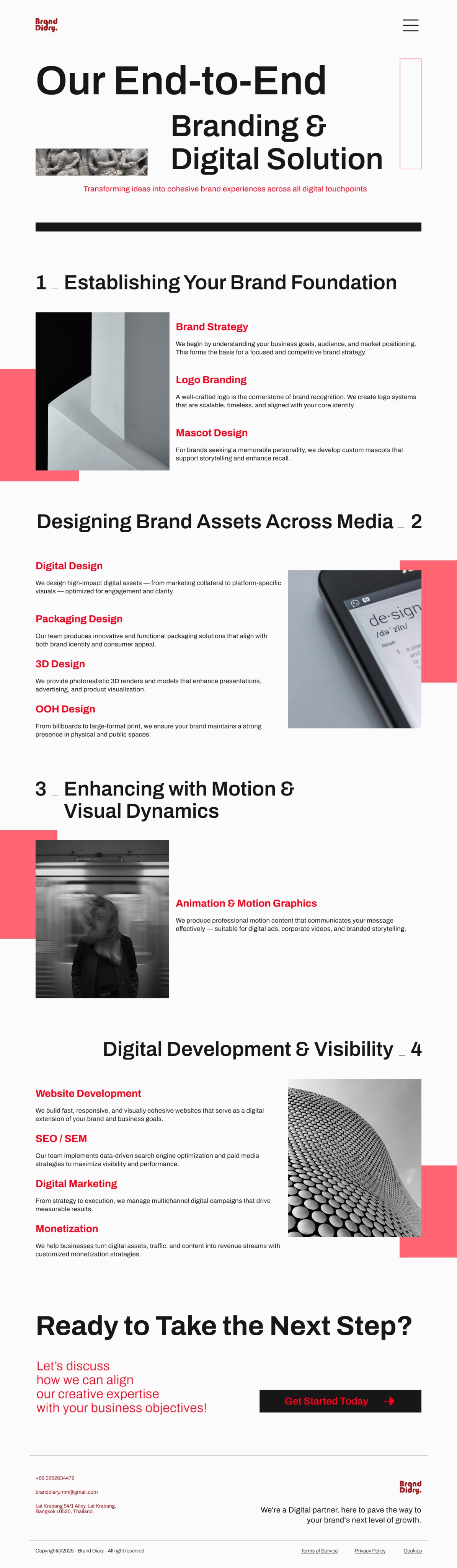
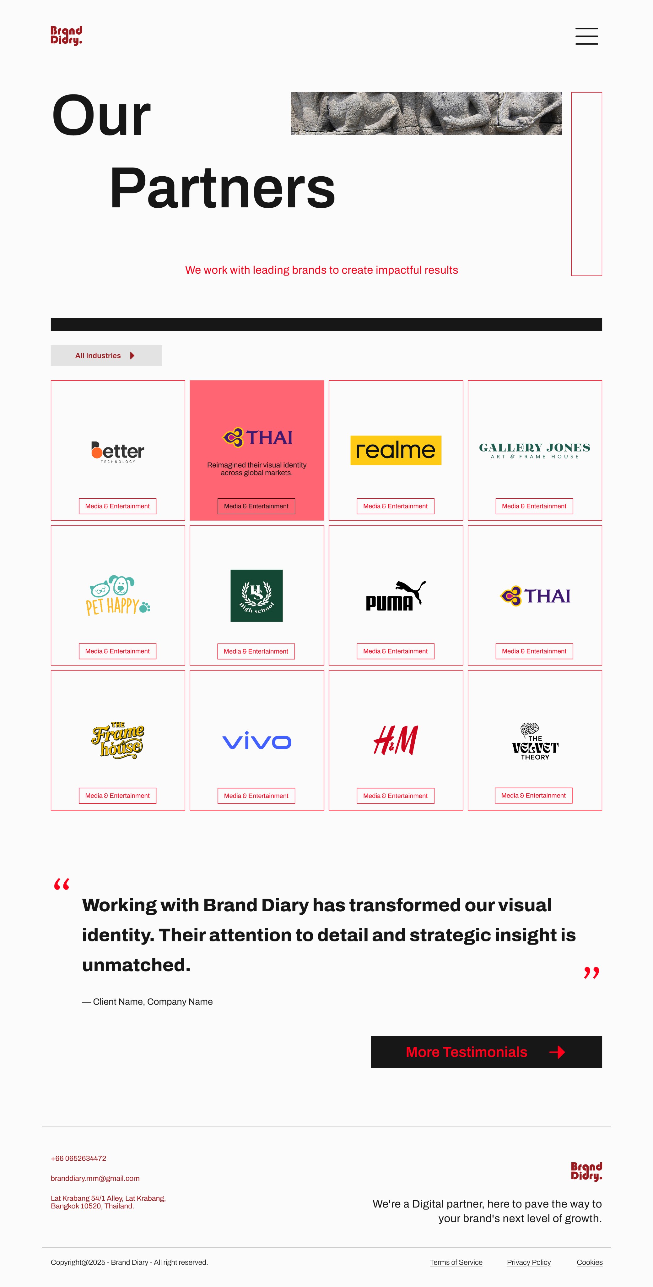
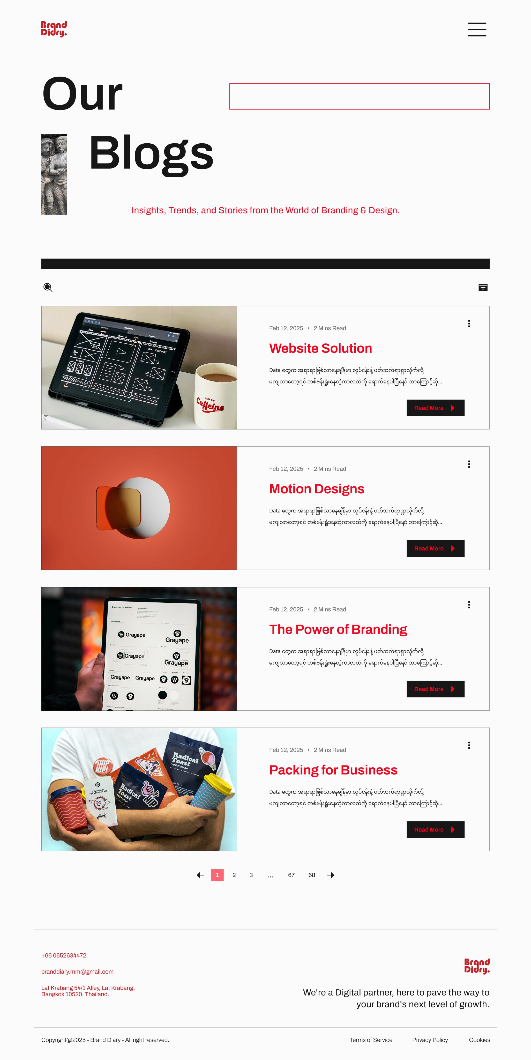
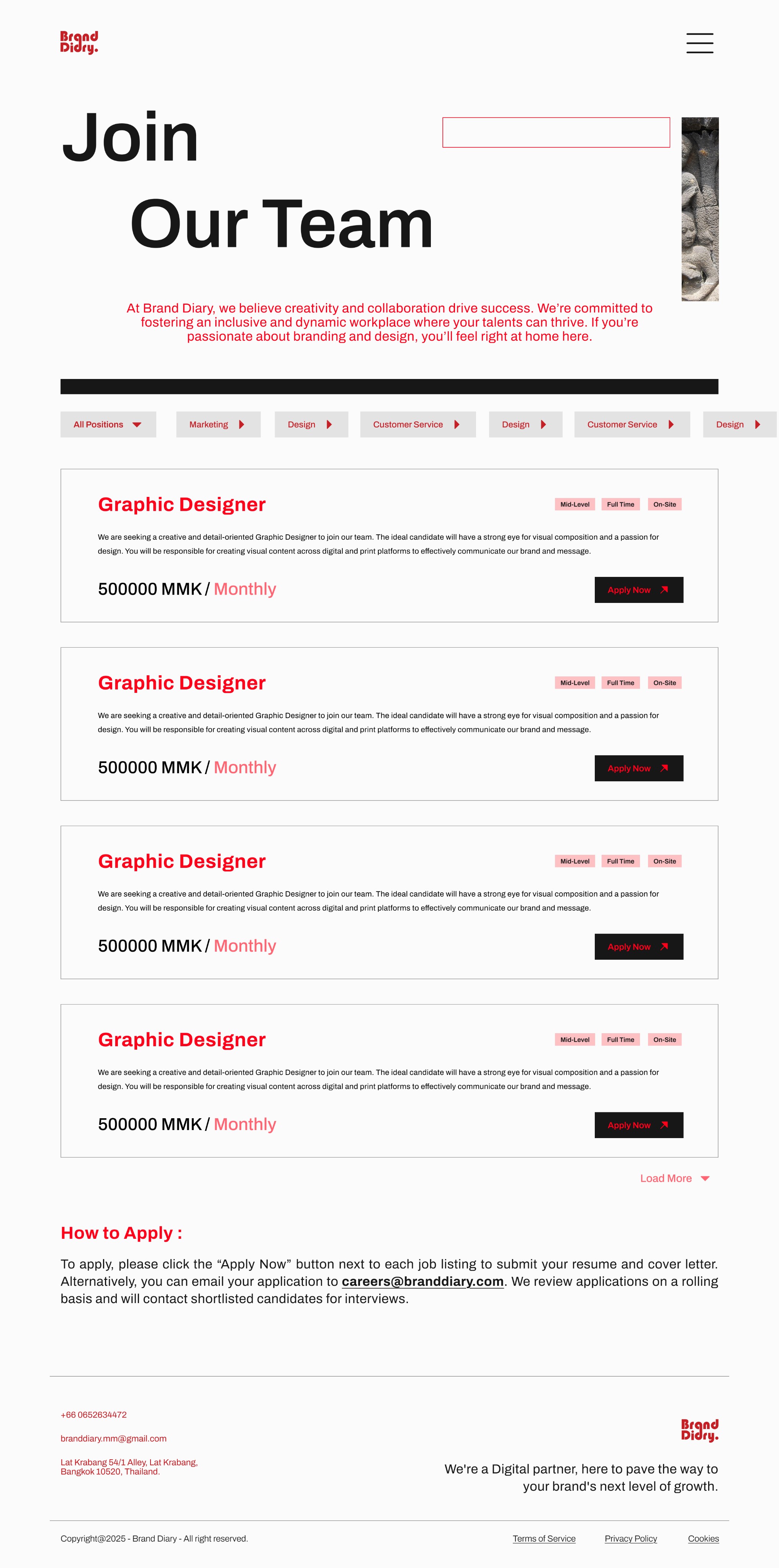
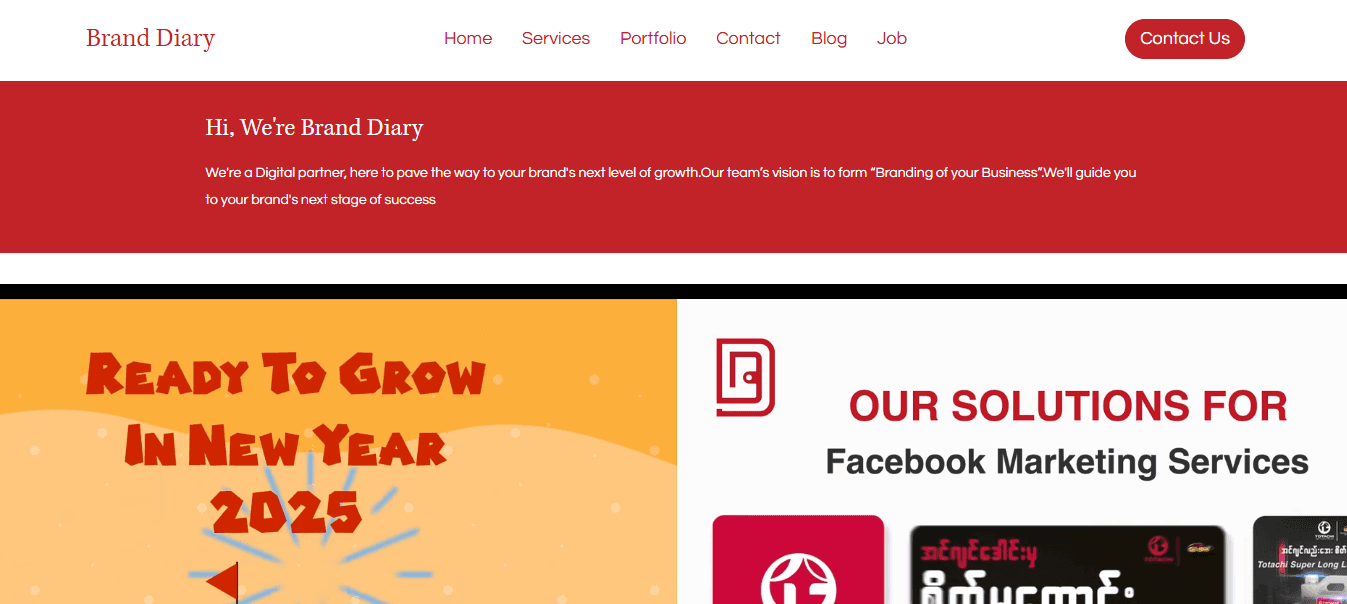
The redesigned Brand Diary website brings clarity, structure, and bold energy to a brand that thrives on creativity. Built around a clean modular grid, the new design emphasizes visual storytelling, a refined color palette, and streamlined navigation. Key pages like Home, Services, and Client Stories now feel more intentional, letting the brand’s voice shine through a consistent, scalable interface.
A bold brand, brought to screen


Throwback designs
After exploring the refreshed UI, it’s worth seeing where the journey began. The original website, while serviceable, no longer reflected Brand Diary’s growth or personality. It felt outdated, unstructured, and disconnected from the bold, creative agency it represented.
The layout lacked visual rhythm. Navigation wasn’t intuitive. Colors and typography didn’t quite express the agency’s sharp identity. All of these gaps made the user experience feel less impactful, especially for creative professionals and modern brands looking for a bold first impression.
This redesign wasn't just about making things look nicer, it was about building a digital presence that speaks with the same confidence and clarity as the work Brand Diary delivers.
Home page
Blogs Page


Our Services Page
Contact Us Page

Designing for a branding agency? No pressure, just make it look like they designed it.
Turns out, whitespace isn’t “empty.” It’s confident, calm, and cooler than a gradient overload.
Reusable components are like closet staples; keep them clean, and everything fits.
Bold doesn’t mean loud. Sometimes, the most impactful thing you can do is step back and let the brand speak first.
From rough sketches to real growth
Designed & Built by Naw Shy in Bangkok © 2025